The Prophets was a real indie band around in 1969 when the American hippie movement was nearning the end of its run. Myself and fellow researchers were tasked to conceptualize and produce an entirely new brand for the band as if they were still together today. Having some fun with the genre, I created a 2020 summer revival campaign with new 70s punk flair.


I went for a saturated yellow and pure black accent colors for the branding. As we'll find out, a lot of punk albums relied on a bright color against black to visually stand out. I also did this due to the common connotations of yellow and black meaning "caution" or "warning." These colors would let people know this branding/group/band is something significant. I didn't want to just stop at a vinyl record, so I created band merch as well. Stickers, guitar picks, and tour posters would all be part of this branding.

I produced a real-life vinyl cover for the album. This detail shot of the interior served as a visual manifestation of the design process. Why stop at the basics when you can incorporate your process work into the final deliverables themselves?

To go along with the rough and raw look of The Prophets' new branding campaign, I made a type-based 2020 tour poster outlining where the group could travel around the US promoting their revival. I found it funny to add completely illogical places that sounded intimidating along with major cities.

The research process began with deep-dives in music history and how it influenced typographic styles. We started back in the 1950's gathering research of artists in different genres since the music and art continually morphed into and shaped the look and sound of different artforms decades later. Fonts were examined, color trends were recorded, and the connotations of the look (and sound) were taken into consideration when drafting ideas for this new look.


In early brainstorming sessions, I was considering completely changing the name of the group from
"The Prophets" to "The Profits" and play with money puns or music that had some reference to currency.
This didn't last long and I realized I couldn't change the entire name of the group...
"The Prophets" to "The Profits" and play with money puns or music that had some reference to currency.
This didn't last long and I realized I couldn't change the entire name of the group...


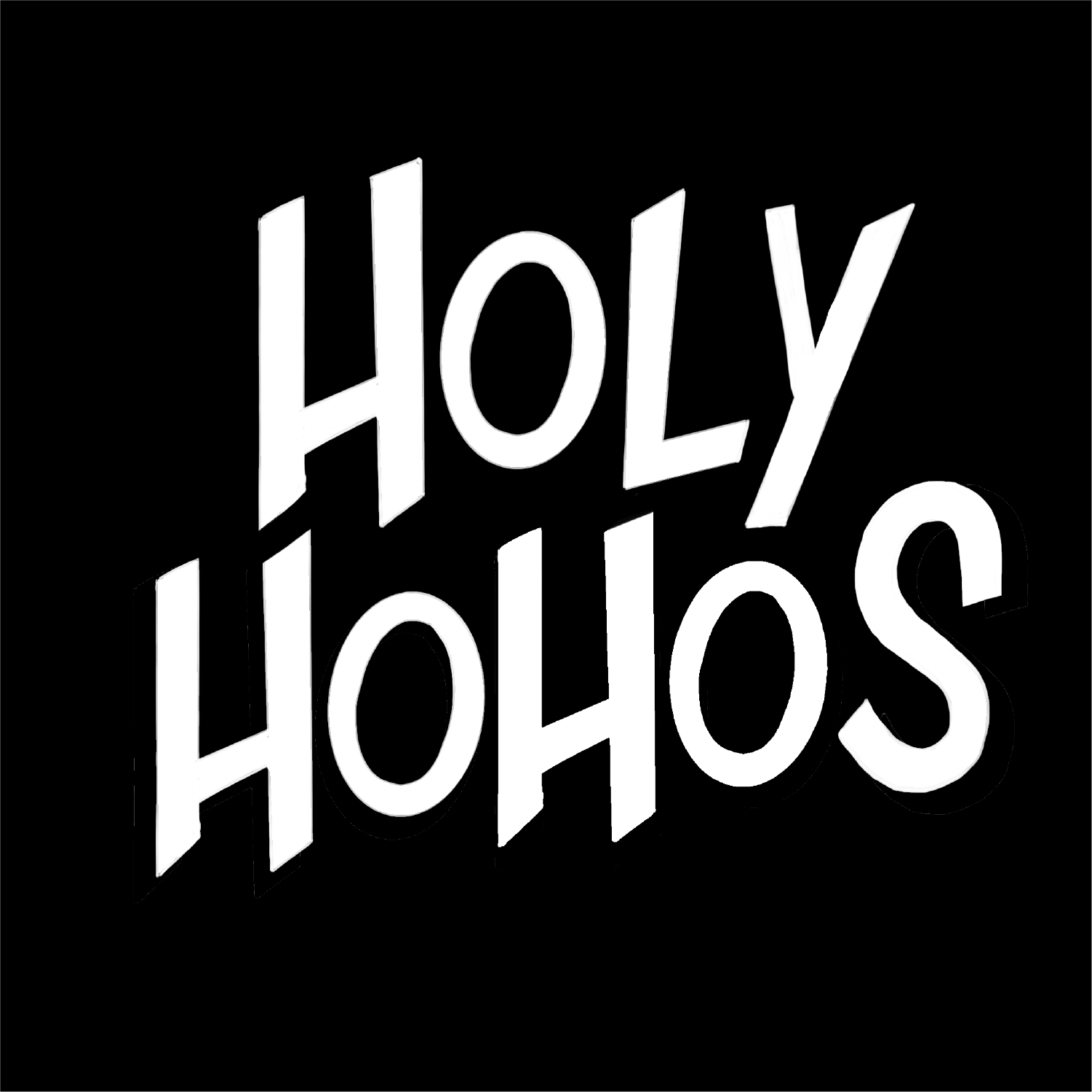
I knew that the band would need to rely on a strong logotype over a logomark to be a consistent opportunity for branding. I was thinking more "Metallica" rather than "Rolling Stones." After looking at, and listening to, punk music from the early 70s up until today, a consistent theme of harsh, bold, angular, design elements came across. Punk began as a response to hippie and disco culture. It makes sense that the look and feel of it generally is an angry, unapologetic statement.


These were just a few of the bands I focused on for research. I certainly added a lot of new songs to
my workout playlists! Visually, a lot of punk albums had contrast between black and a bright color.
It was important to emulate this with the new branding in order for it to look convincing.
my workout playlists! Visually, a lot of punk albums had contrast between black and a bright color.
It was important to emulate this with the new branding in order for it to look convincing.

Detail shot of the physical tour poster.


Unsatisfied with just the album and merch, I wanted to take the rebranding farther and make a
legit battle vest. This was the back showing off the name of the band adhered with safety pins. My reasoning was that if there is going to be a revival of this band, their fans would want to show their support. It was a lot of fun making it, if I had a larger budget and timeline, I'd want to develop multiple variations of this battle vest. Maybe turning it into a leather vest next.
legit battle vest. This was the back showing off the name of the band adhered with safety pins. My reasoning was that if there is going to be a revival of this band, their fans would want to show their support. It was a lot of fun making it, if I had a larger budget and timeline, I'd want to develop multiple variations of this battle vest. Maybe turning it into a leather vest next.