The task
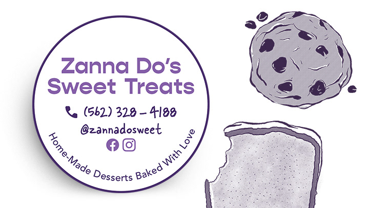
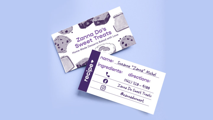
I was tasked with branding an independent bakery and delivering printed assets like business cards and menus. The owner makes home-made sweets by hand and specializes in cookies, sweet breads, and brownies.
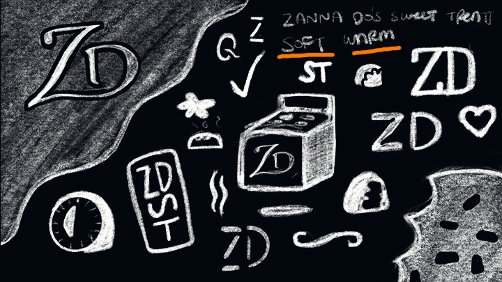
early idea sketches. "Soft" & "warm" were obvious starts
My Role
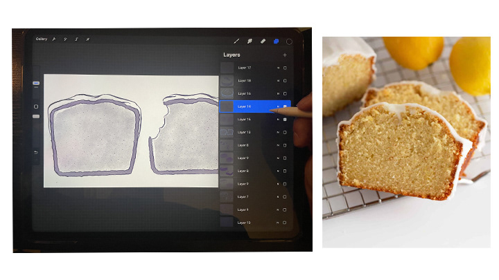
I was given creative freedom when creating the logo and branding. I took into consideration the owner's request to use purple, her favorite color, as a significant brand color. For this project, I acted as an illustrator, logo designer, typographer, and print specialist.
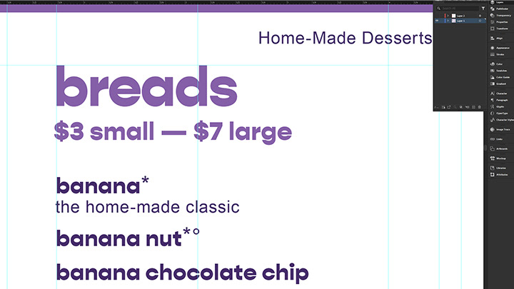
THE PROBLEM
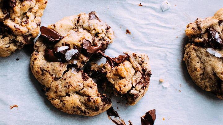
How can I make assets easy for the bakery to reuse to maximize the most out of the illustrations? How do you make people envision the most delicious treats they can imagine when food often doesn't photograph well? Where is the visual balance between homemade and premium?
THE OUTCOME
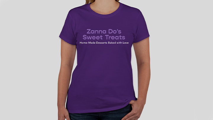
I blended approachable illustrations and warm typography to evoke a friendly and soft brand. This was achieved with typefaces like Gopher and lowercase headlines. Zanna Do's Sweet Treats is now memorable amongst pop-ups and boutiques in Southern California. Functionally, branded business cards, menus, and t-shirts help the bakery attract and connect with more customers.